Mattioli Woods
A clever new brand
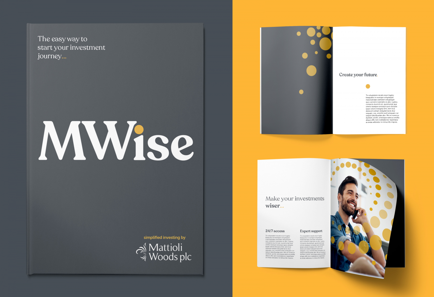
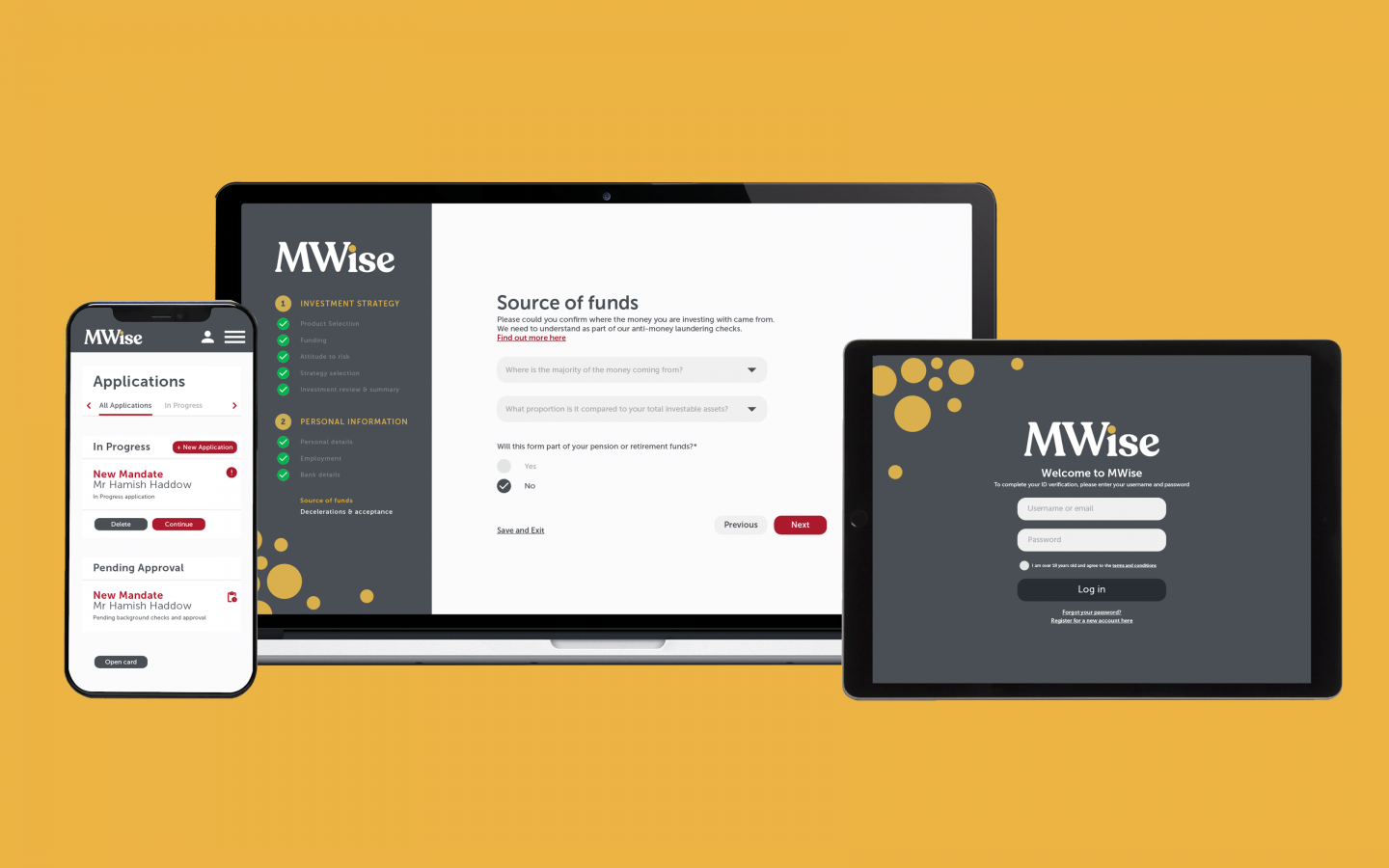
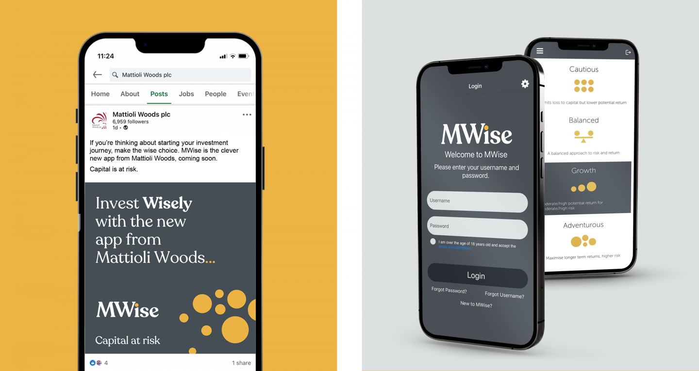
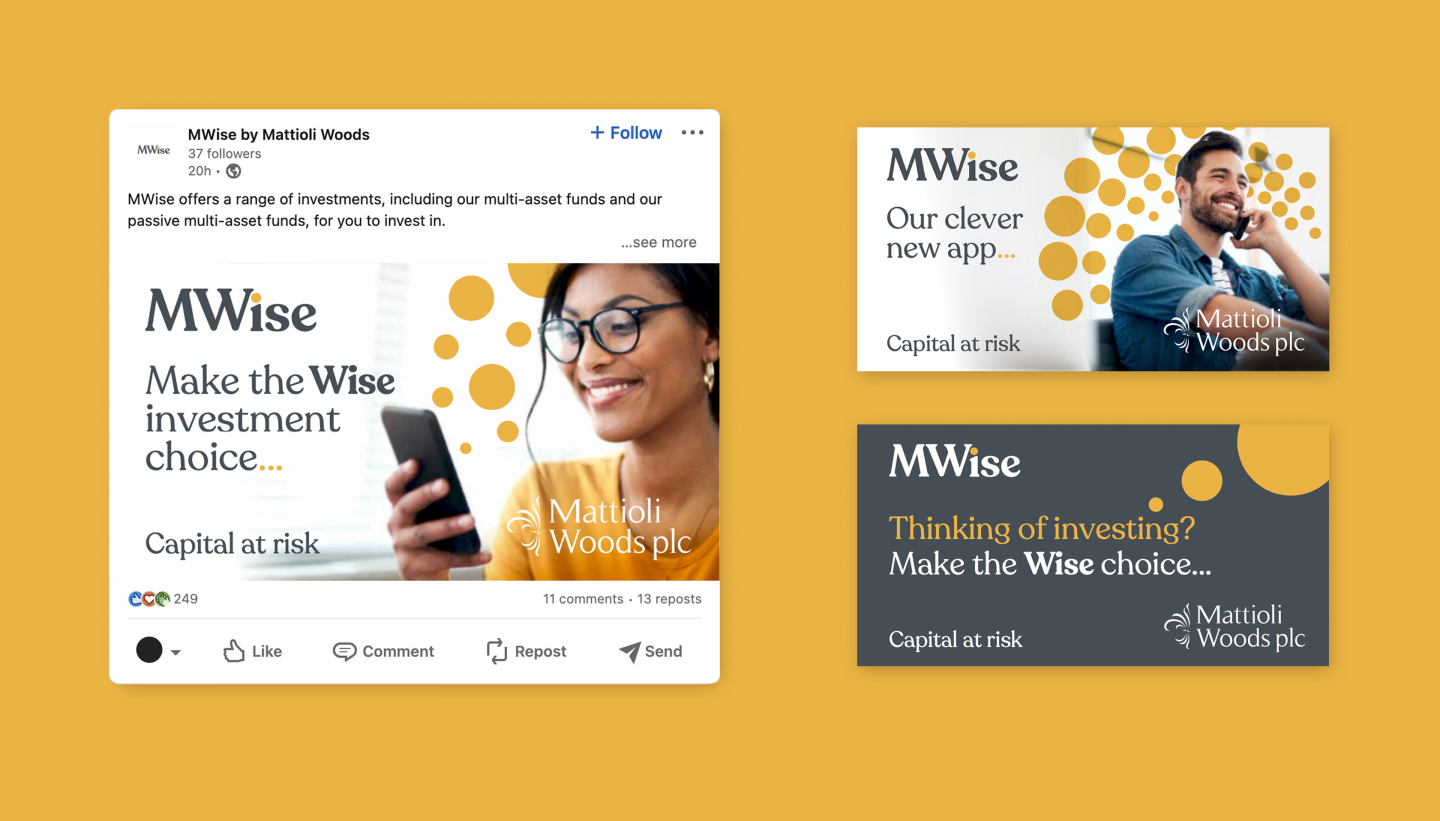
We’ve created the brand for MWise, a new investment app from Mattioli Woods that makes it easy for beginners to manage small, regular investments on the go.
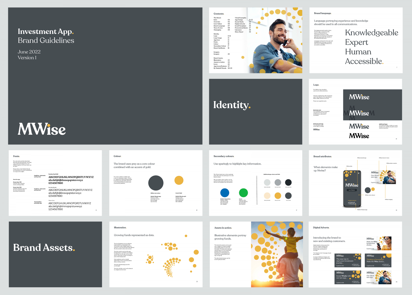
Building on Mattioli Woods’ core brand values, MWise exudes knowledge and experience while feeling accessible to entry-level investors. The bold, iconic logo is best used white out of the core dark-grey brand colour for maximum visual impact.
Full Description
One of the brand’s key visual components is a system of dots, which use the same gold accent colour as the tittle on the ‘i’ in the logo. Like graphic coins, these dots start small and build across different applications to symbolise growth. They can come to life in various ways: as custom icons; to add punctuation to copy, such as ellipses; and as patterns to overlay lifestyle photography.
Featuring target customers at different milestones of their lives, the MWise brand imagery is positive, inspirational and future-focused, with bright skies and yellow details that complement the gold accent.
While easy and convenient, the MWise app is not fully automated: it’s supported behind-the-scenes by the human expertise of the Mattioli Woods team. This personal touch comes through in the brand’s tone of voice: honest, clear and concise, but with just enough personality to add warmth and trust.