Actuate
A fluid new identity
We have created a fluid, dynamic identity for Actuate UK, a brand-new organisation that unites eight leading trade, technology and professional bodies within engineering services.
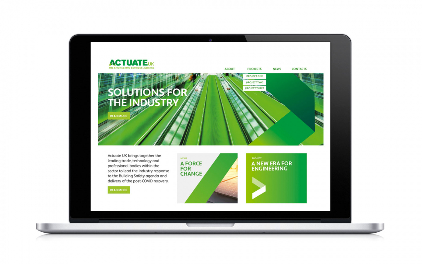
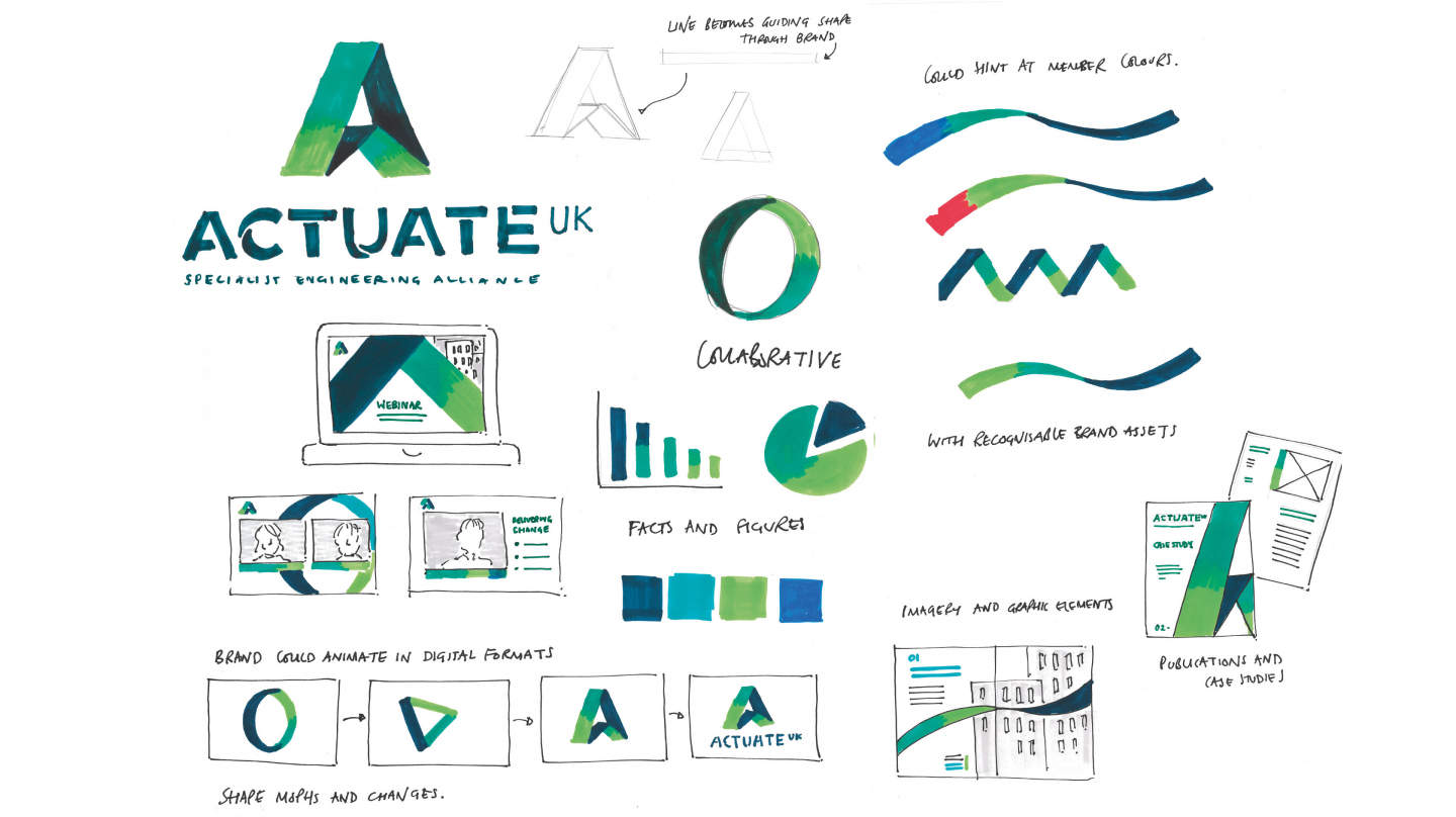
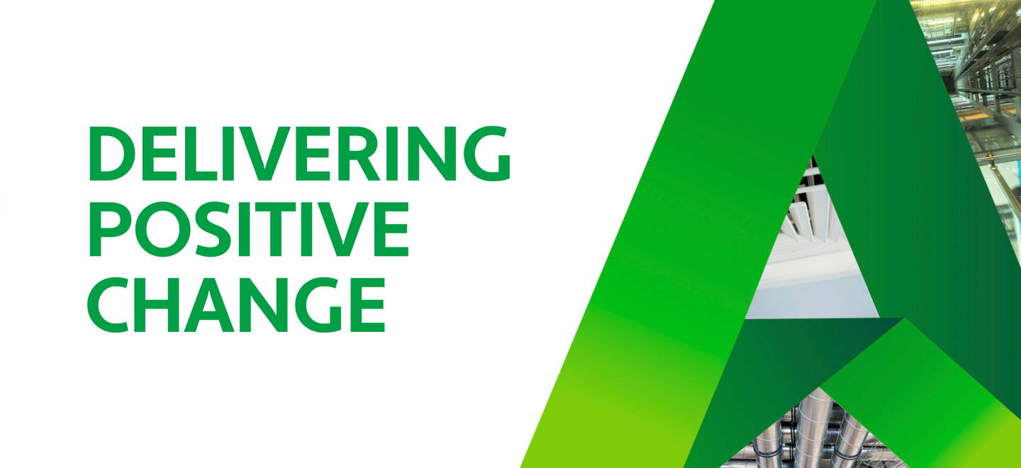
We took a clean, modern approach based around a striking 3D letter ‘A’, which represents the built environment at the heart of Actuate UK’s business.
Full Description
Built from a distinctive green-gradient line that becomes the guiding shape throughout the brand, the A can be folded, unfolded and manipulated into different shapes to represent movement and change across a range of different applications – with scope to develop more iconography in the same style as required.
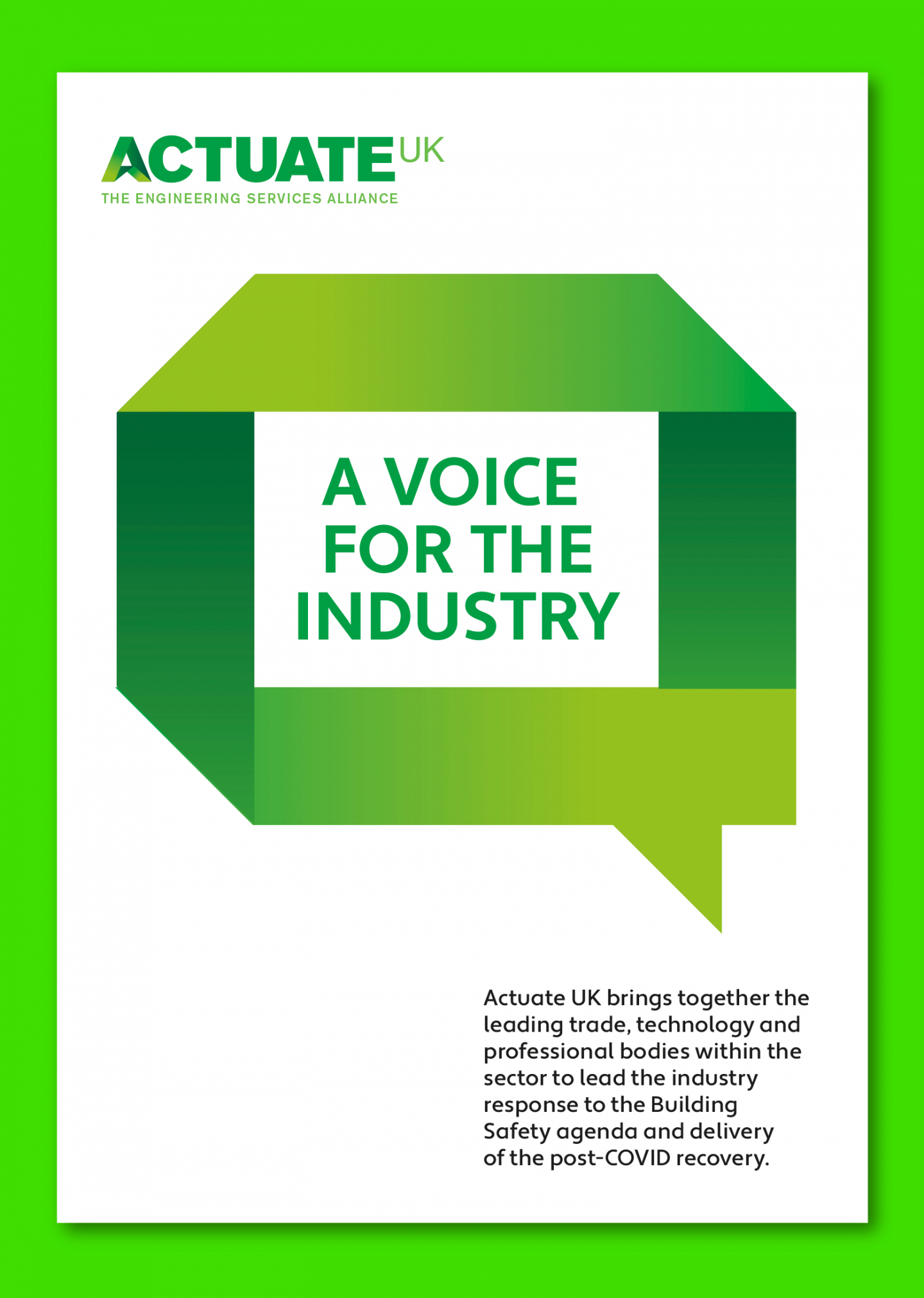
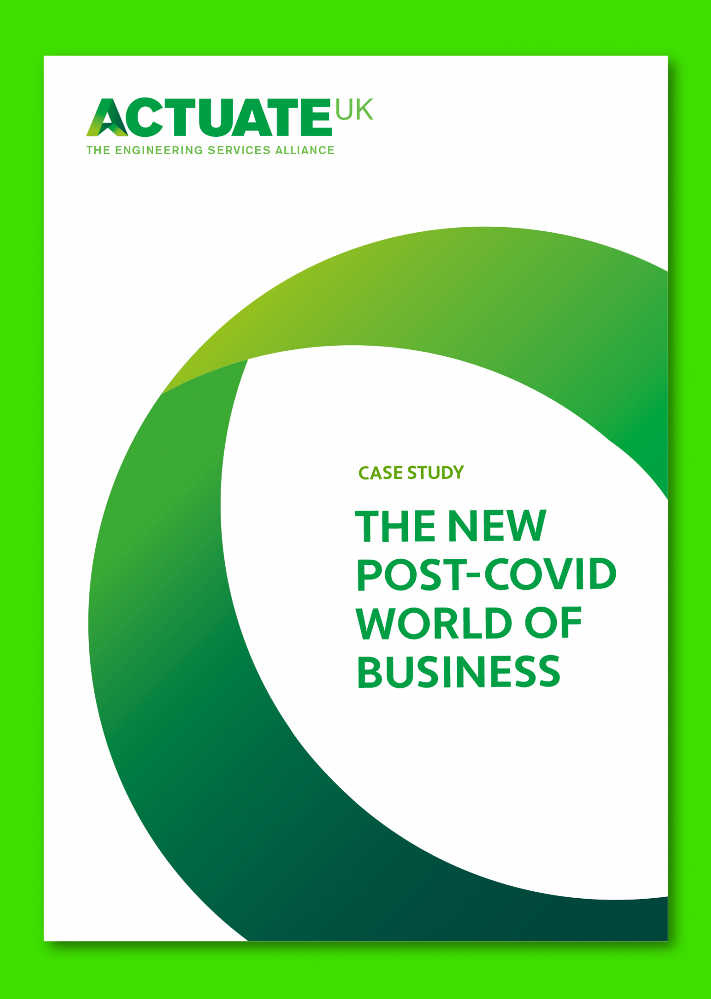
These include simple framing devices for content such as circles and squares; graphic icons such as arrows, ticks and crosses; and a stylised speech bubble to emphasise the organisation’s thought-leadership role around issues such as building safety, and the post-COVID recovery of the industry.
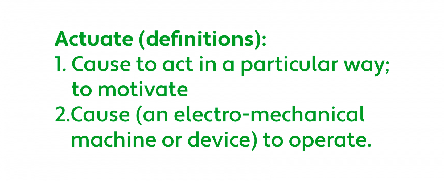
The name has a dual definition that’s a perfect fit for both the sector as a whole and Actuate UK’s influential role within it: ‘actuate’ can mean to cause something to act in a particular way, or more literally to cause an electro-mechanical machine or device to operate.
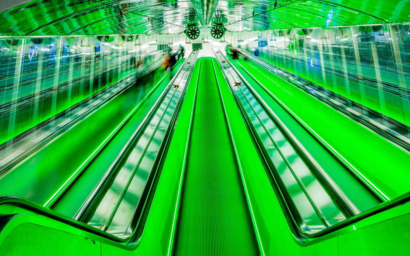
To find the right balance between precision and scale, we suggested using innovative, positive-feeling imagery that incorporates detail shots alongside more dramatic architectural photography. As part of a wider set of guidelines, we also advised how type, colour and tone of voice could all be used to bring Actuate UK’s new brand to life.