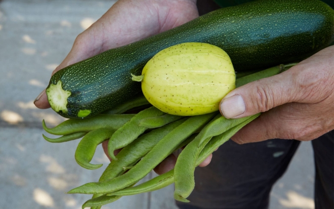
Ansley Common Allotment Society
Brand Identity and Packaging
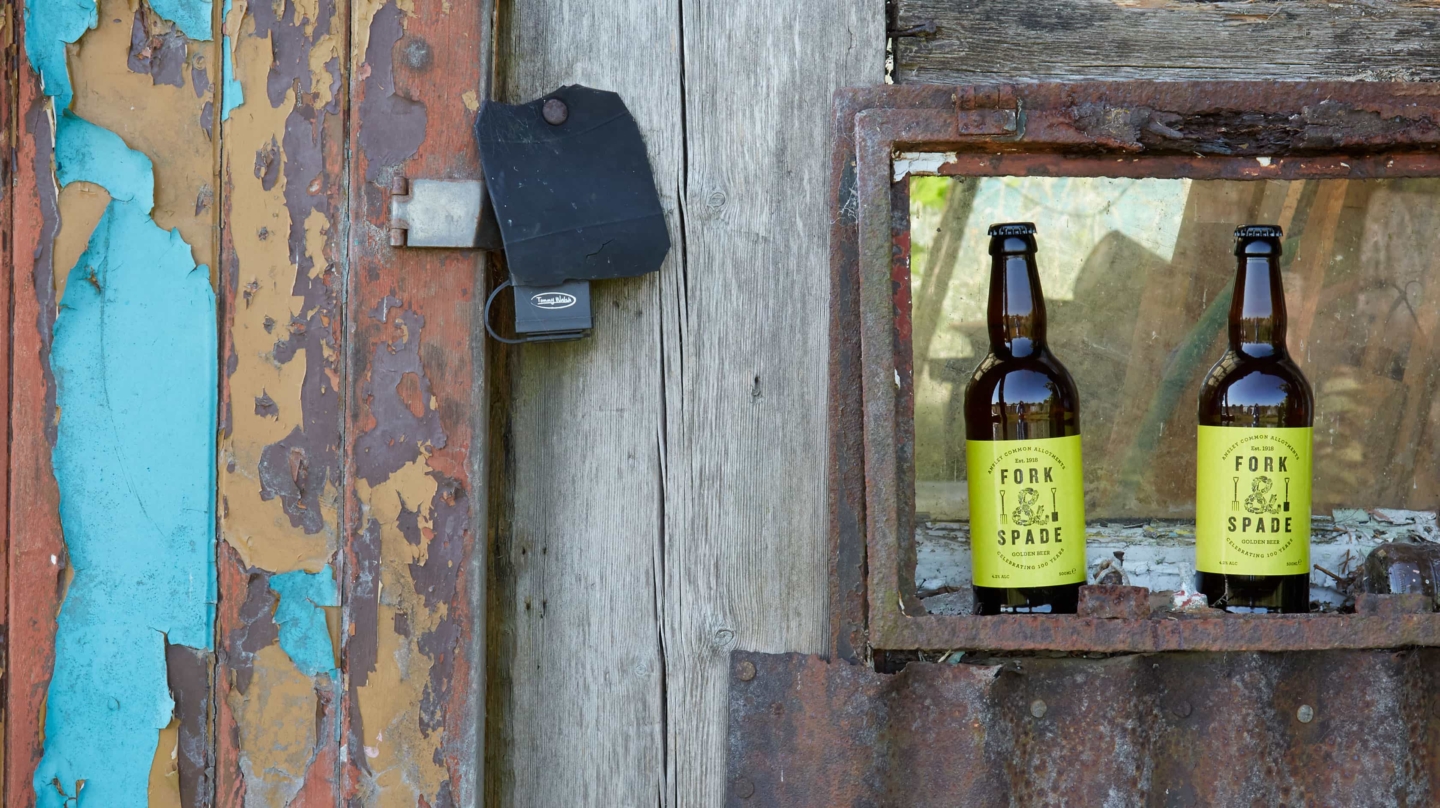
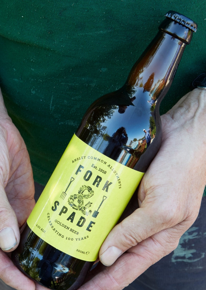
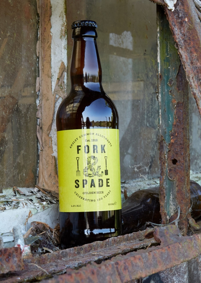
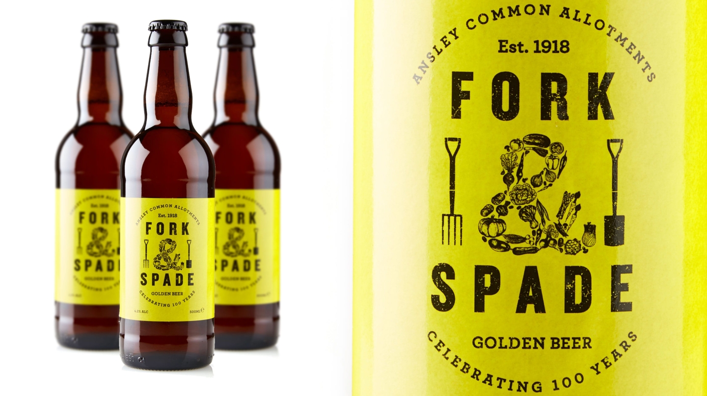
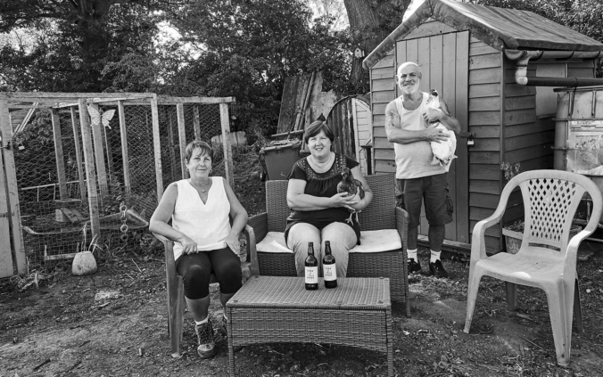
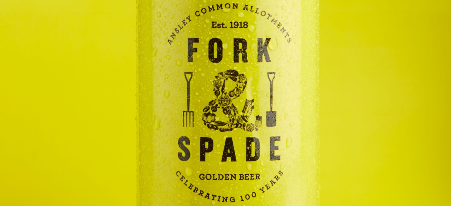
To celebrate the 100 year anniversary of the Ansley Common Allotment Society we were asked to design a label for a commemorative ale, to be sold at a charity event.
Full Description
The ale, brewed locally by Church End Brewery, already had a great name ‘Fork & Spade’, so all we had to do was bring that to life. We designed the packaging to have a retro feel as a nod to graphic styles of the past.
We wanted the label to look like it was designed and printed back in 1918, the year the allotments were first worked on to add authenticity to the design. The print was limited to black on yellow to give a simpler, more basic print finish and the design uses bold typography and woodcut illustrations.
During the charity event all the bottles quickly sold out, helping to raise much-needed funds to help the Allotment Society to hopefully continue for another 100 years!