Setting a new brief for the University of Northampton
At STB, we’re strong believers in giving back to the design community. We’d rather dedicate our time and experience to giving a leg up to the next generation than back-slapping ourselves by entering design awards.
As part of this, we’ve forged strong links with various local universities over the years. We recently challenged final-year Graphic Communication students at the University of Northampton to rebrand a community organisation or venue, with some inspiring results.
Students had free rein to choose: it could be a local theatre or art gallery, a music venue, a charity, or any of the thousands of organisations up and down the country that they felt some kind of personal connection to.
We kicked things off with a video briefing session. Their challenge was to consider all the ingredients of a strong brand identity – from typography to tone of voice – as well as all the potential ways their chosen organisation could promote themselves, and how their idea and messaging could flex.
Then we visited them halfway through the project for an informal crit session. We chatted through their initial thoughts and research, shared advice for developing their ideas, and answered any questions.
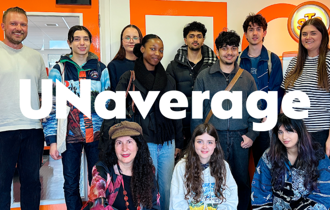
Finally, the students presented their final solutions to us in person. We were impressed by their commitment and the variety in their responses, and their passion for organisations that meant something to them personally really shone through.
It wasn’t a competition, but we think the following three responses deserve a special shout-out here:
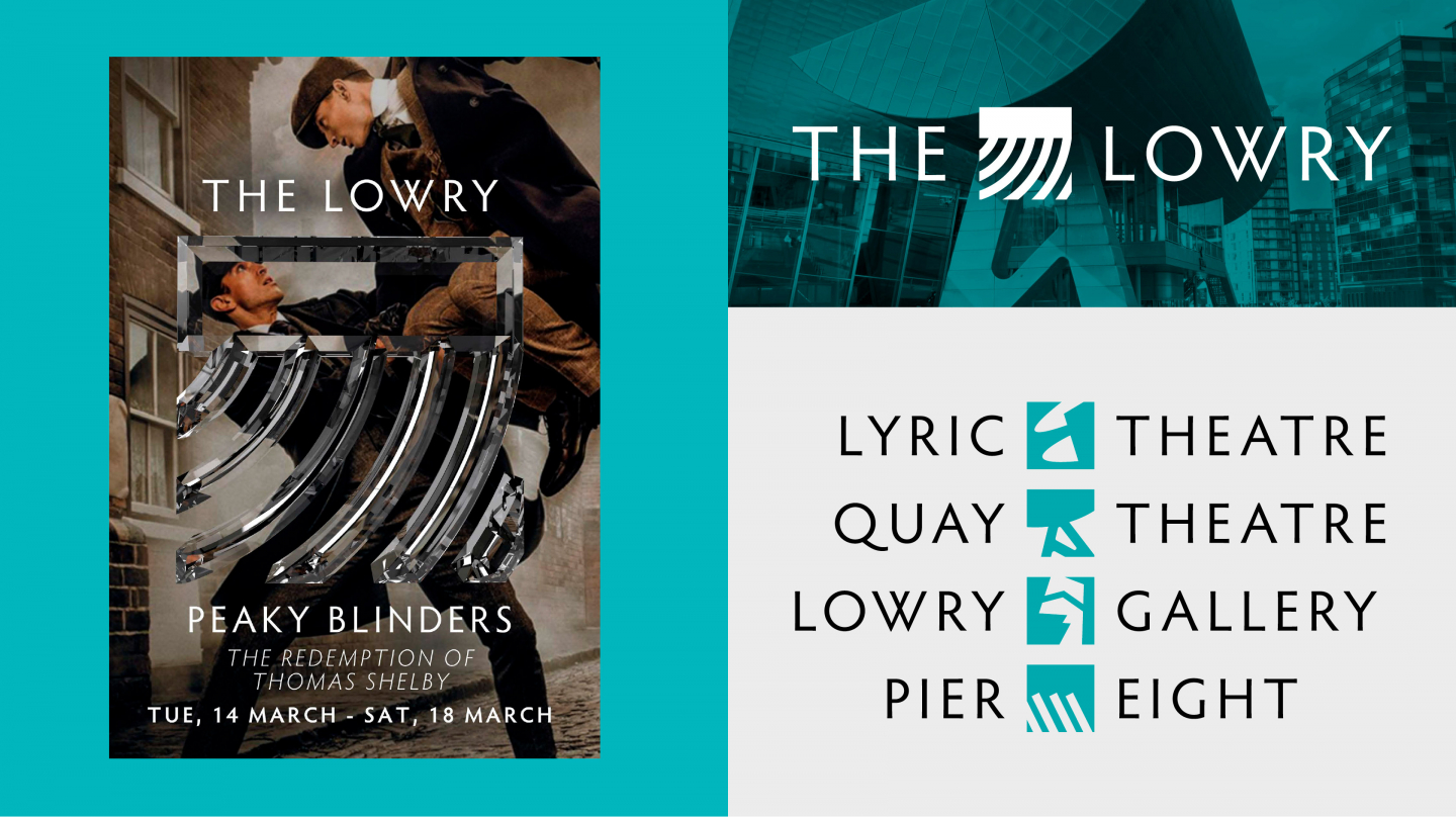
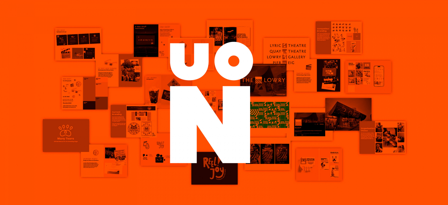
Louis Parkinson-Sykes – The Lowry
@louisparkinsonsykes
Louis spotted a great opportunity to rebrand The Lowry, an iconic venue whose current identity he felt didn’t do it justice. Backing up his response with thorough research, Louis created something meaningful, relevant and celebratory of the space.
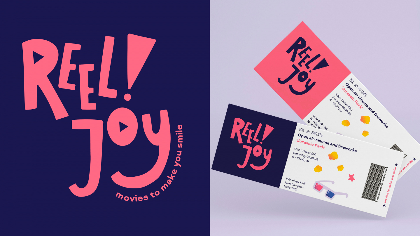
Carrie Slinn – Reel Joy
@carrieslinndesign
Carrie went further and renamed her chosen organisation. The Bruce Green Foundation brings the joy of cinema to children from challenging backgrounds. With illustration and custom lettering to add personality, her new ‘Reel Joy’ brand feels fresh and fun.
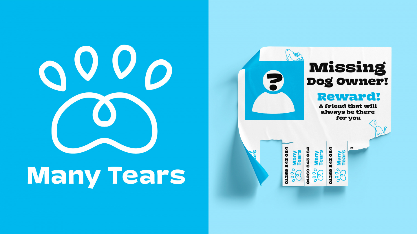
Ruby Stephens – Many Tears
@ruby.stephens.designs
Ruby chose Many Tears, an animal charity close to her heart. Taking feedback from our interim crit on board, she developed her thinking into a well-resolved solution – including some lovely messaging and a confident use of colour and type.