UoN x STB Live Brief
For this year’s live brief with the University of Northampton, we set students the task of rebranding an independent venue, group or organisation.
We weren’t interested in the big chains or businesses that have the marketing budgets to invest heavily in design and advertising. We wanted to represent the smaller guys – the grassroots organisations that are often run by passionate volunteers. Those that are at the heart of their communities but could really benefit from some creative input. And ideally places the students have some personal connection to.
As it’s up to the students to choose the client, we always get a real variety of responses. From an ancient Chinese temple in Malaysia, to a garden centre in South Africa, to an island church in Normanton that withstood demolition after the local community rallied around. Fascinating places with fascinating stories to tell, and an opportunity for students to have a project in their folio that’s unique to them.
Following a virtual briefing, we ran an interim crit session to chat through and offer feedback on their initial ideas before they submitted their final responses. We were really impressed by the quality of the work and wanted to feature a few of our favourites below:
Roadmender
Wong Ting Yue
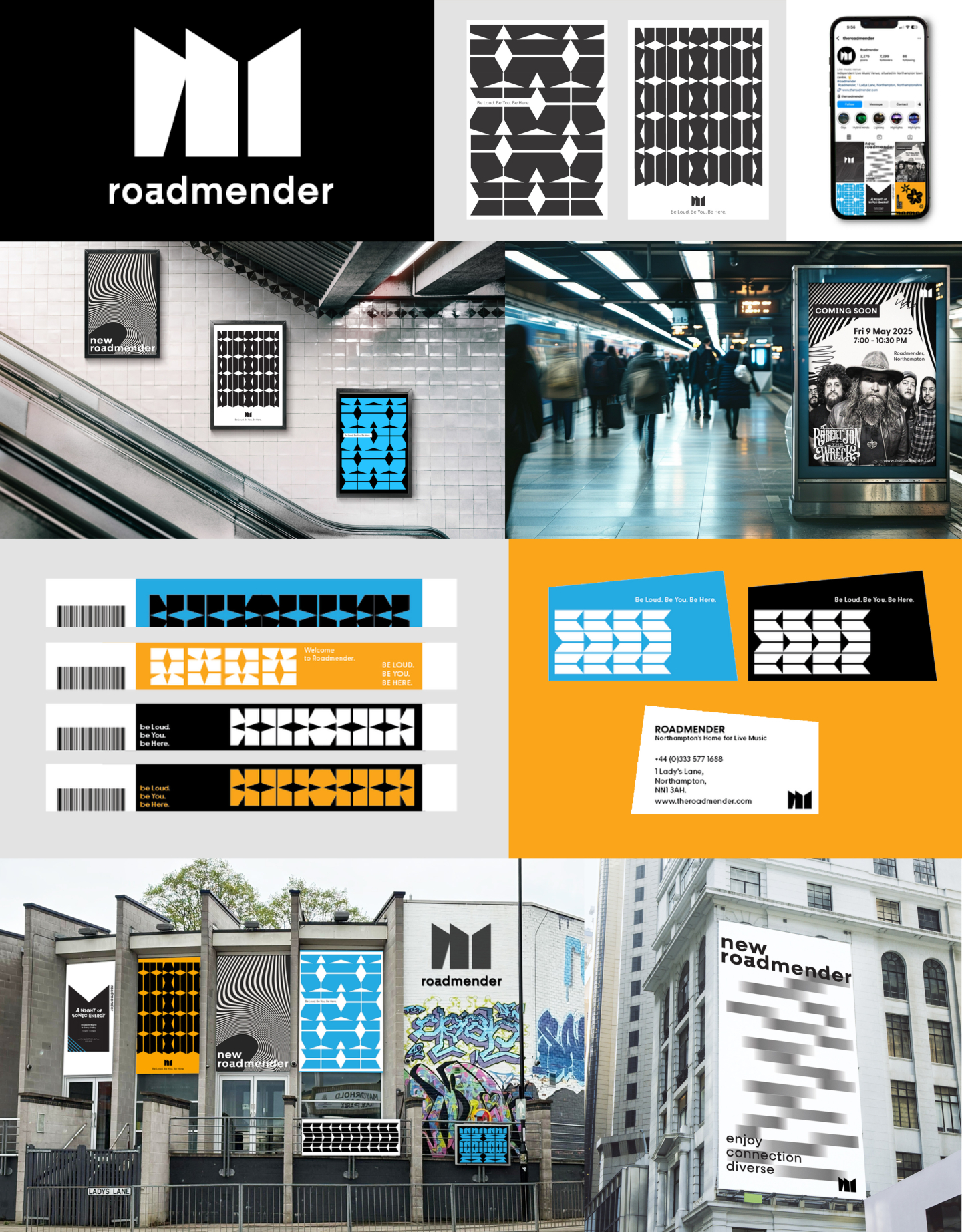
“The Roadmender, a historic live music venue in Northampton, has been a staple of the town’s cultural scene since the 1970s. Originally a youth club and community arts centre, it has evolved into a renowned spot for live performances across various genres, from indie and house to grime and drum and bass.
The rebranded Roadmender logo draws inspiration from the building’s architectural front view, capturing the brand’s distinctive character and long-standing legacy. Its design uniquely reflects Roadmender’s identity, showcasing both its personality and specialized focus in the creative and cultural scene. An additional motif pattern design uses lines, circles, and irregular shapes of the logo to create a dynamic, memorable visual that reflects the brand’s creativity and uniqueness.”
See more of Wong’s work here
Sol Haven
Ana Ailincai
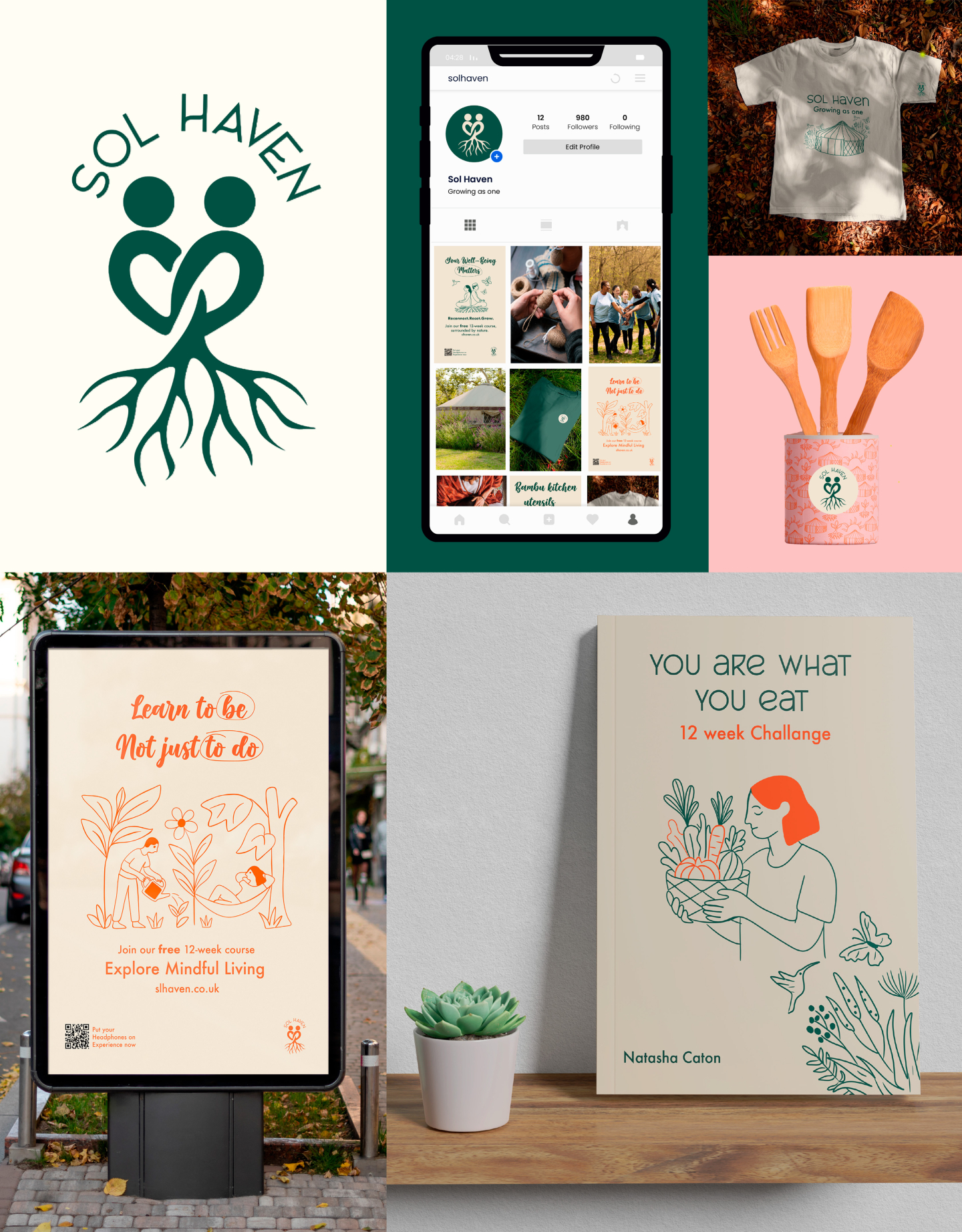
“Sol Haven is a community farm based in Northampton, focused on wellbeing, nature, and bringing people together.
This project is about giving them a refreshed brand identity that truly reflects their values. I created a logo that captures their essence: rooted in community, sustainability, and personal growth. For this rebrand, I used line drawings to convey a sense of calm and simplicity.
The generous use of negative space brings a peaceful, uncluttered feel, which helps create a calm experience whether someone is scrolling online or seeing an advert in public.”
See more of Ana’s work here
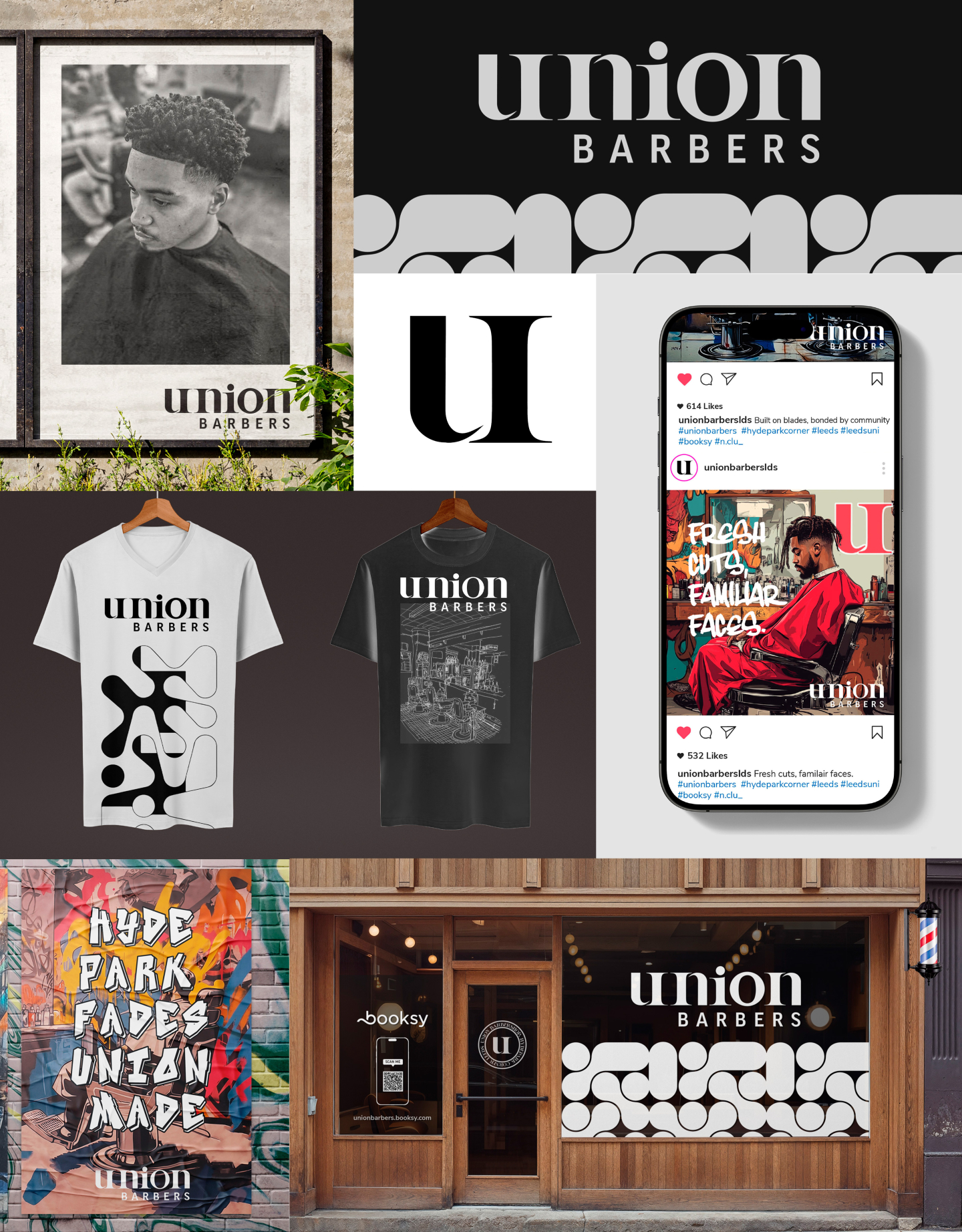
Union Barbers
Kai Willis
“For this rebrand, I chose The Union Barbershop in Hyde Park, Leeds – a place deeply personal to me, run by my family and rooted in community. My concept centers on celebrating the barbershop’s local identity by blending its modern style with the raw, expressive character of Hyde Park’s graffiti culture.
Inspired by the nearby skatepark and the area’s vibrant street art, I created graffiti-style posters and backgrounds to reflect the creative energy and realness of the neighbourhood. The visual language amplifies local voices and artistic expression, positioning The Union not just as a place for fresh cuts, but as a pillar of community, heritage, and connection.”
See more of Kai’s work here

