A cut above the rest
Our sharp new look for Zyliss knives has just hit stores, expanding their extensive range of kitchenware products.
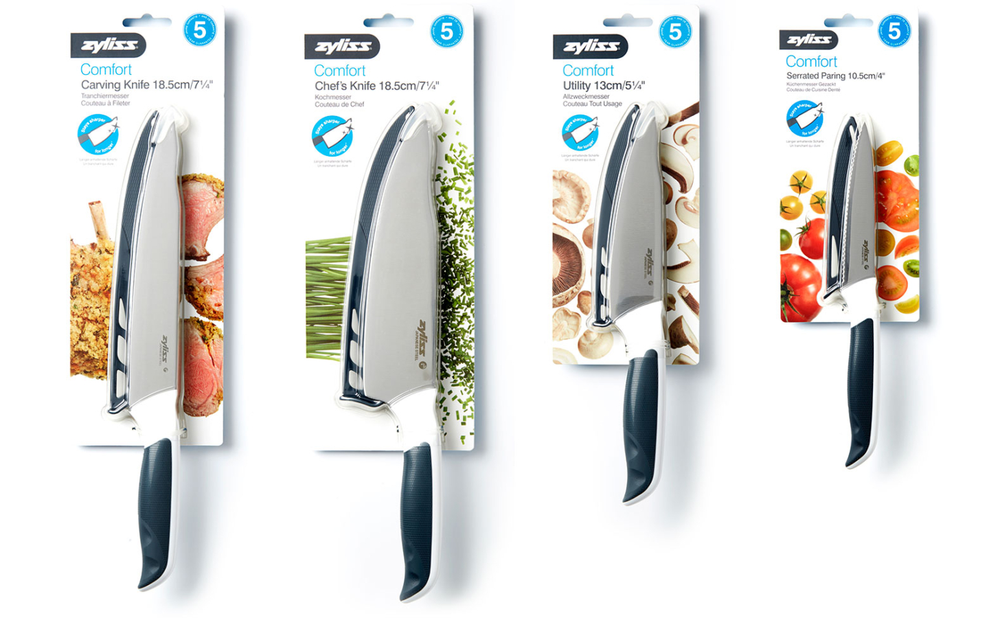
Merchandising is extremely important to the brand, so the design needed to be impactful, work across varying pack sizes and support brand presence when merchandised with other Zyliss products.

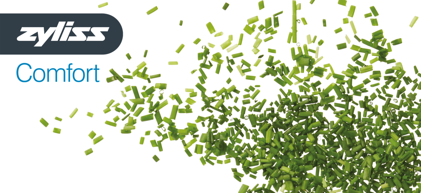
We felt it was important that the packaging helped consumers identify what each of the knives was capable of and most importantly what they should be used for. Zyliss is all about making food preparation more enjoyable, so we wanted to portray creativity as well as precision and control through beautifully prepared ‘before and after’ ingredient patterns. The packaging format allowed us to use the knife to divide the ‘before and after’ patterns, with each knife having a relevant ingredient pattern.
The range is now in stores and initial sales have been positive – in under 6 months of being in selected retail partner stores, the Comfort range already accounts of 10% of the Zyliss knife turnover.


